Clearer Navigation, Better Access: Helping Older Adults Find Essential Services

Project Overview
Sound Generations connects older adults in the Seattle area to essential services like transportation, food security, health support. A year-long UX engagement to find out why users weren’t using their online resources, and fix it.
Role
UX Researcher and Designer
Methodologies
Survey, Interviews, Focus Groups, Usability Testing
Tools
UserZoom, Dovetail
WordPress, Figma, FigJam
Timeline
April 2024- March 2025
Background
Sound Generations, a non-profit serving King County, Washington, supports over 25,000 to 64,000 older adults, caregivers, and adults with disabilities annually through various community programs.
Their programs reach thousands of people but many of those people were arriving at the website and leaving without finding what they needed. The problem wasn't a lack of information. It was a lack of clarity, structure, and guidance for an audience that needed all three.
The primary users- older adults, caregivers, and community partners - are often navigating the site during stressful moments. They need to feel immediately reassured that they're in the right place and that finding help will be straightforward. A confusing website, for this audience in particular, isn't just a UX problem. It's a barrier to care.
Research
I used a mixed-methods approach to capture both the scale of the problem and the texture of it- combining a broad user survey with internal stakeholder interviews, focus groups, and direct observation through task-based usability testing.
3 questions drove the research: Who is actually using the website (and who isn't, and why)? Where are users getting lost, hesitating, or giving up? And how could the site better support people in finding and acting on the programs they need?
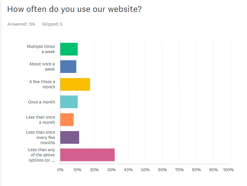
100+
survey participants across the community
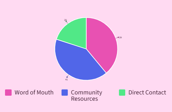
32%
of users don't use the website at all, relying on flyers, word of mouth, and mail instead
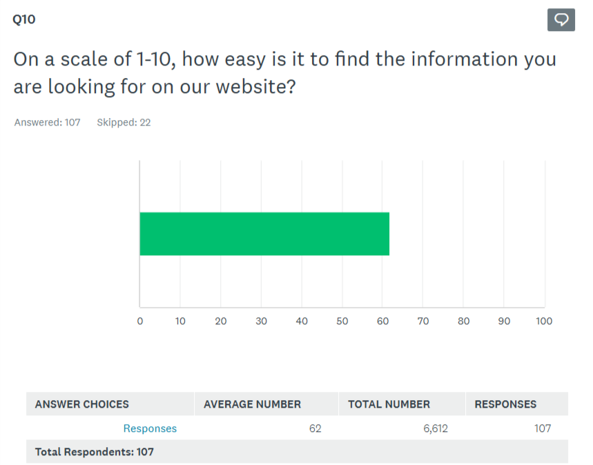
6/10
average rating for both findability and overall site quality
Interviews with program managers added a crucial internal perspective: there was a consistent gap between how staff described services and the language users actually used to search for them. Program pages were answering questions nobody was asking and missing the ones staff fielded on repeat.
Findings
Four patterns that explained the disconnect
The homepage looked good but didn't guide anyone anywhere
70% of users wanted to explore programs- but only 12.6% navigated to the Programs page after the homepage. Visually strong, strategically absent. The homepage wasn't functioning as a decision-making entry point.
Users stayed in familiar corners and missed everything else
Participants gravitated to transportation services and rarely discovered other programs. Navigation and content hierarchy weren't signaling what else was available - exploration was entirely accidental.
Pages explained "what" but not "how"
Content was informative but not actionable. Users couldn't easily find eligibility requirements, understand how programs actually worked, or identify their next step. This created cognitive load where there should have been confidence.
90% of usability participants needed help to complete basic navigation tasks
Across findability tasks, almost no one succeeded independently. Mobile form-filling, text-heavy pages, and unclear program naming were the biggest sticking points - and the most fixable.
Design Question:
How can I help users quickly understand available services, feel confident navigating the site, and take action independently?
Persona
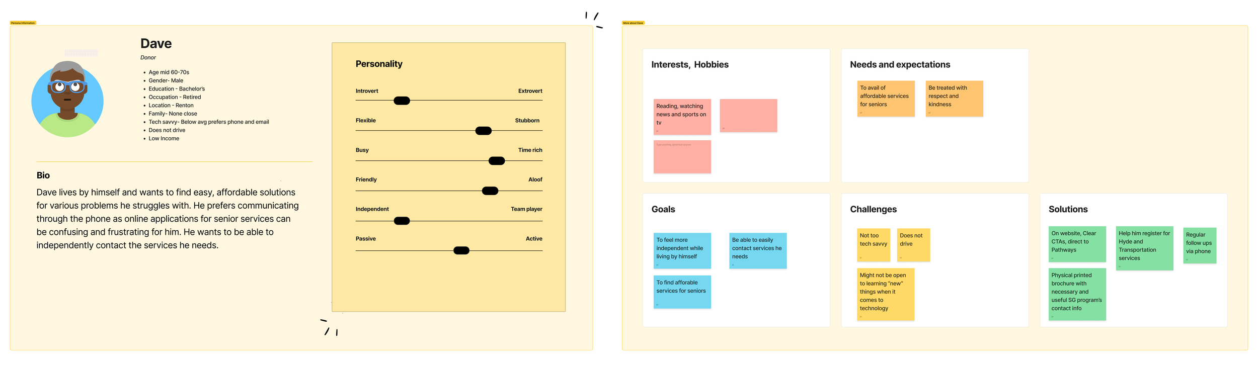
Dave represents the intersection of the site's most underserved audience and its highest-stakes use case.
He's motivated and capable but the current experience asks too much of her in a moment when he needs things to simply work.
Design Strategy
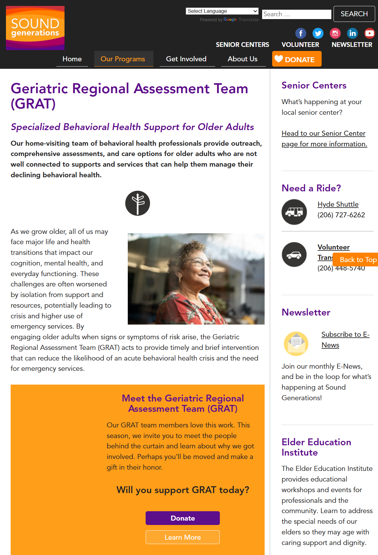
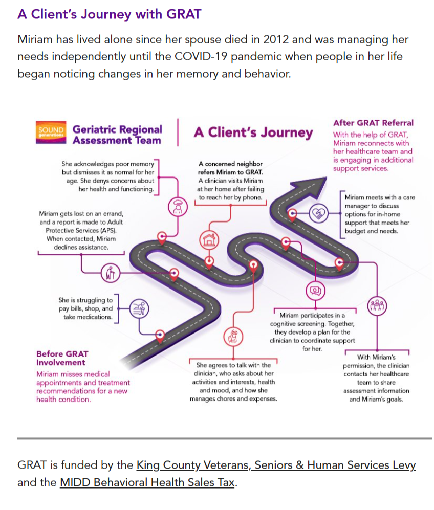
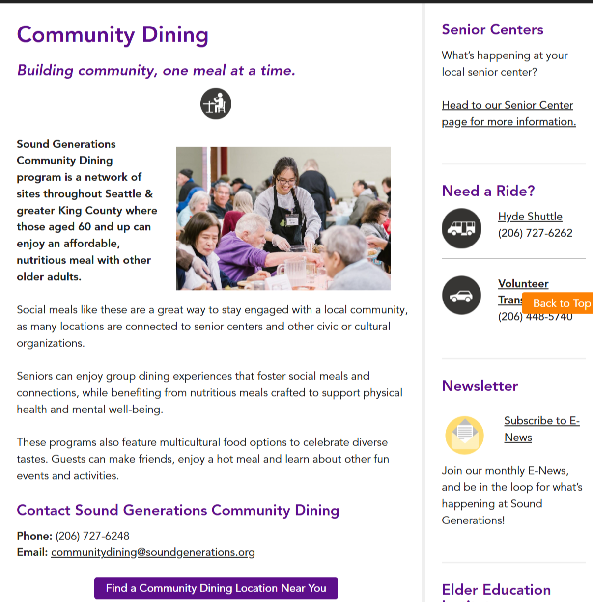
Using the GRAT and Community Dining pages as examples
Principle 01
Visual communication
Replace generic stock imagery with program-specific photos. Add diagrams and process visuals to reduce cognitive load — supporting comprehension, not just decoration.
Principle 02
Accessibility-first layouts
Contact information above the fold, no scrolling for critical details. Integrated forms with clear CTAs. Simplified navigation with consistent branding across all program types.
Principle 03
Navigation and wayfinding
Reorganize menus around user intent, not internal org structure. Surface key actions directly on pages. Add breadcrumbs so users always know where they are.
Principle 04
Content structure and hierarchy
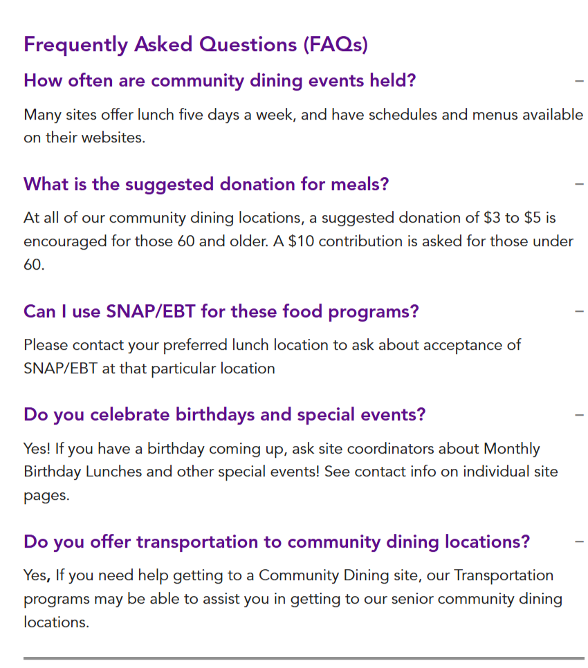
Break dense pages into scannable sections. Lead with titles like"how it works" or “what we do” before detail. Use progressive disclosure so users aren't overwhelmed on arrival.
Each template was tested with real users. Feedback was gathered, designs were refined, and the process repeated, with gradual rollout planned specifically to avoid disorienting existing users with sudden changes.
Reflections
Qualitative research surfaces things surveys can't. The user interviews revealed nuances — language, hesitation, emotional context — that the quantitative data could only gesture at. The 32% who'd abandoned the website entirely had stories behind that number worth understanding.
Resourcefulness is a design skill. Working within a non-profit context meant adapting methods to limited budgets and schedules. Having backup approaches ready — and staying flexible when the primary plan shifted — kept the research moving.
Gradual change protects existing users. A complete redesign launched overnight would have confused the people the site was trying to help. Rolling out updated templates incrementally meant improvements could land without creating new disorientation.
Internal stakeholders are users too. The program manager interviews were one of the most valuable parts of the process. The gap between how staff described services and how users searched for them shaped almost every content recommendation.